Bootstrap Templates - Header - Mobile App - LearnWD

Learn Web Design

Monday, May 21, 2018

Bootstrap Templates - Header - Mobile App


Bootstrap templates - Header - Mobile App lets you showcase your mobile application on your website with a fully responsive design that looks great on any device.


The design and PSD for this template was provided by Designmodo, I have simply written the HTML & CSS for their design. If you would like to download the PSD you can do so here https://designmodo.com/startup/sources/


For a live preview of this template click here.


Block Requirements

  • Bootstrap 4

Implementation

For this to work you must meet the requirements listed above.

To make it as easy as possible to incorporate my templates into your own website design I've created two snippet files which you can view at the bottom of this post. The first snippet has the HTML code and the second one has the CSS code. To add these to your website begin by copying the HTML code and pasting it into your websites html file. Finally copy the CSS code and paste it into your websites stylesheet. That's all, Now the block should be working.
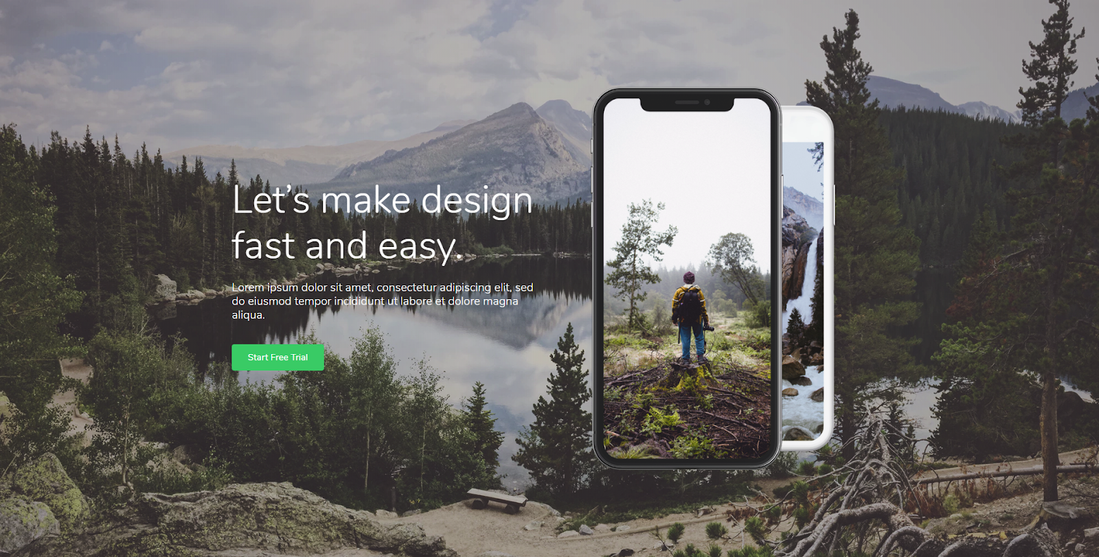

HTML Code:

<!-- Header 2 -->
<section class="header-2">
<div class="container h-100 d-flex text-center text-md-left">
<div class="row align-items-center justify-content-center">
<div class="col-12 col-md-6">
<h1>Let’s make design fast and easy.</h1>
<p class="mx-auto mx-md-0 mb-4">Far far away, behind the word mountains, far from the country Consonantia.</p>
<a href="http://learnwd.com/"><button type="button" class="btn btn-primary rounded mr-2">Start Free Trial</button></a>
</div>
<div class="col-12 col-md-5 py-5">
<img alt="image" class="img-fluid" src="https://i.imgur.com/pmuIwnd.png">
</div>
</div>
</div>
</section>


CSS Code:

/*start of header-2*/
.header-2 {
font-family: 'Nunito', sans-serif;
font-size: 16px;
line-height: 1.5;
background: linear-gradient(rgba(22, 23, 24, 0.3), rgba(22, 23, 24, 0.3)), url("https://i.imgur.com/6RyoZB7.png");
background-size: cover;
background-position: center center;
color: #ffffff;
overflow-x: hidden;
padding: 100px 0;
}
.header-2 h1 {
font-size: 3.875rem;
font-weight: 300;
}
.header-2 p {
font-size: 1.375rem;
font-weight: 300;
font-family: 'Nunito Sans', sans-serif;
}
.header-2 .btn {
padding: 9px 26px;
background-color: #18c967;
color: #FFF;
border: solid 2px #18c967;
border-radius: 2px;
}
.header-2 .btn:hover {
color: #FFF;
background-color: #1f69ff;
border-color: #1f69ff;
}
@media (min-width: 992px) {
.header-2 {
height: 100vh;
min-height: 850px;
padding-top: 0;
padding-bottom: 0;
}
}
@media (min-width: 768px) {
.header-2 p {
width: 85%;
}
}
/*end of header-2*/

No comments:

Post a Comment